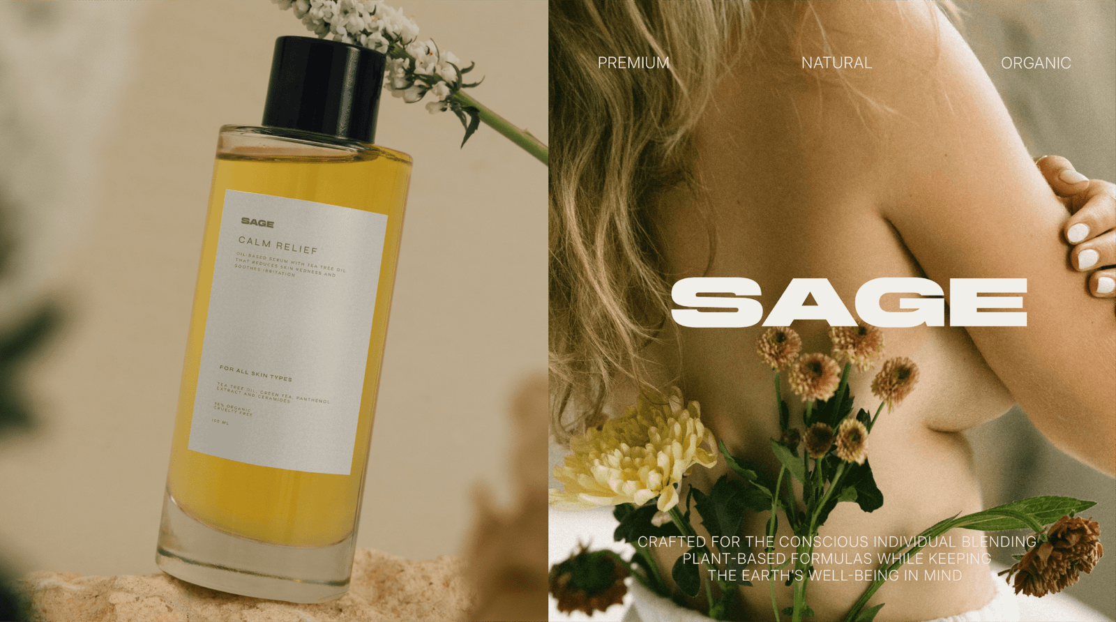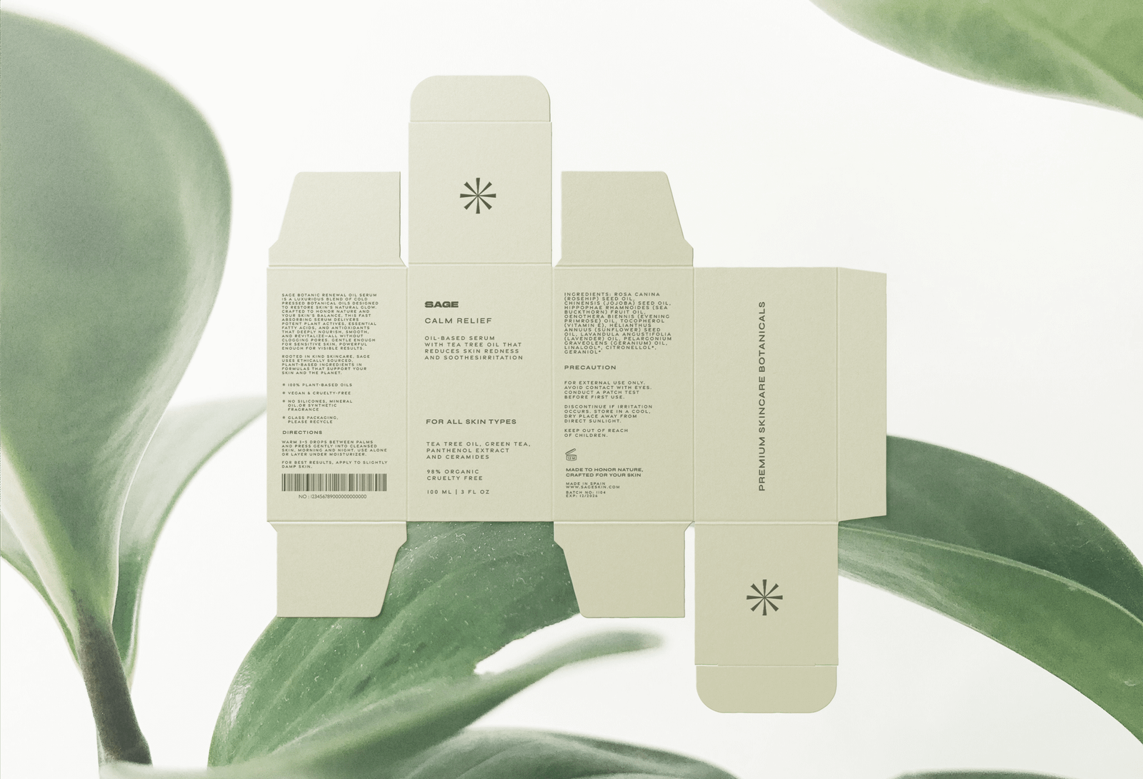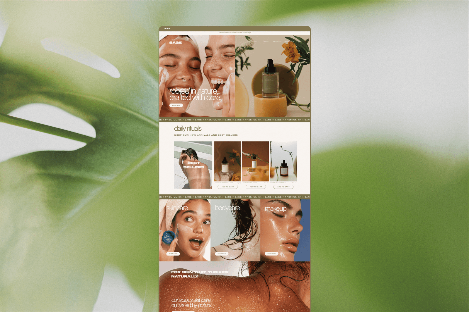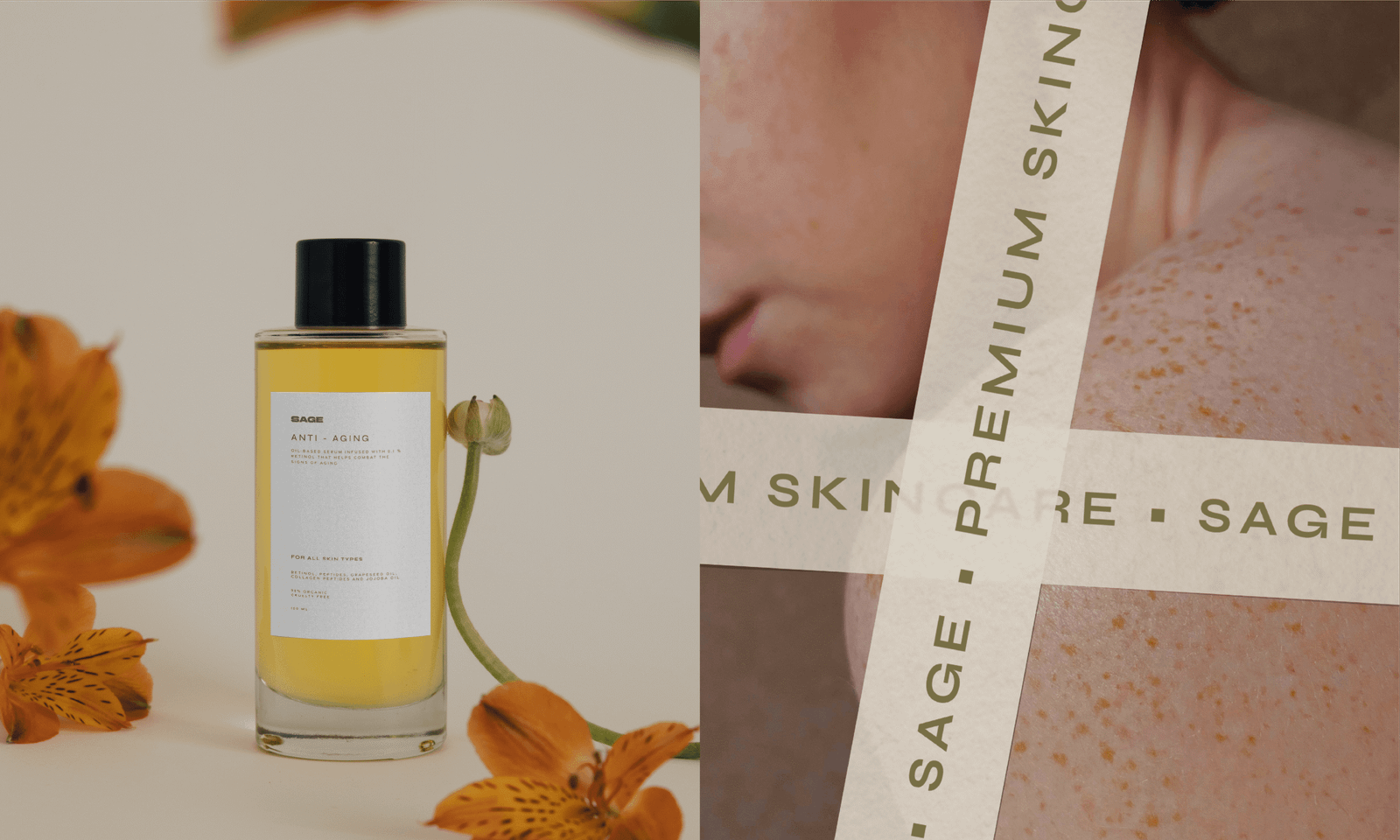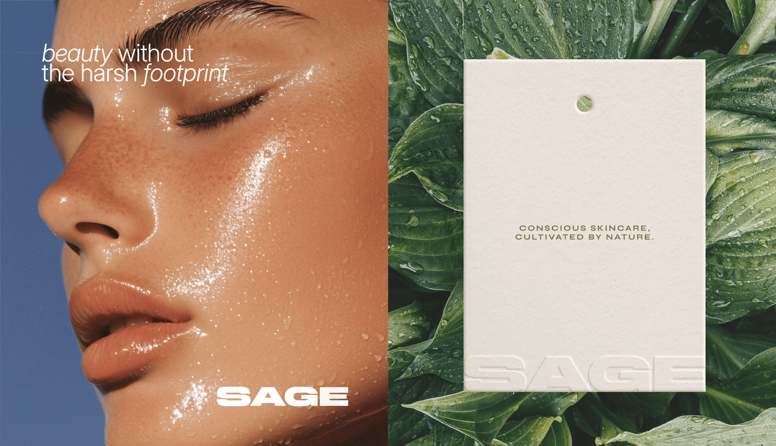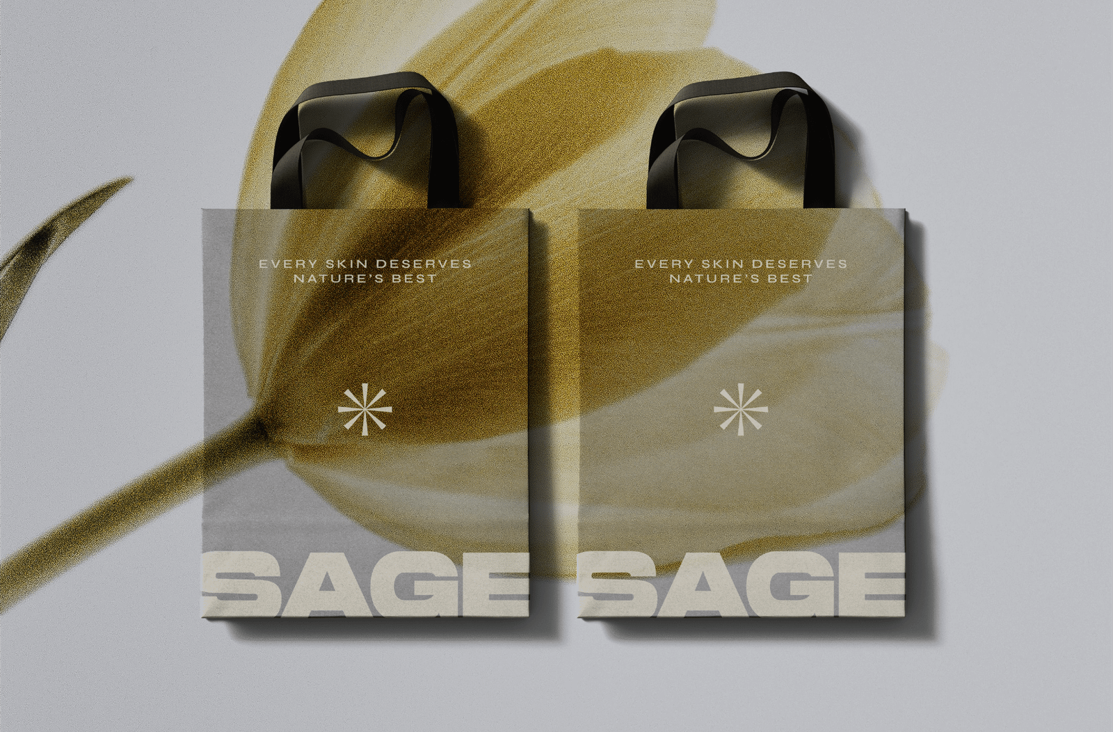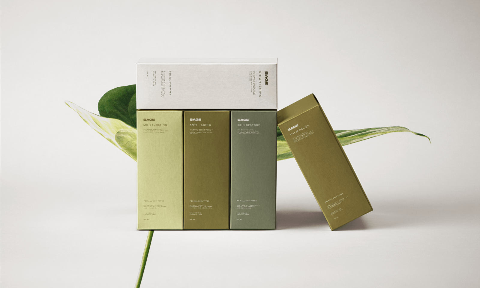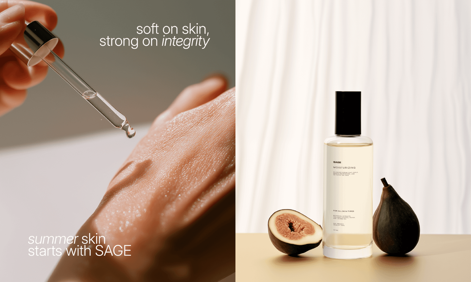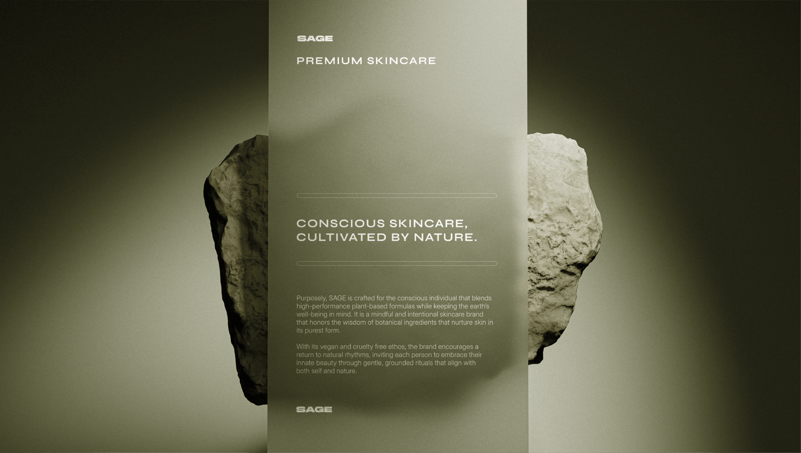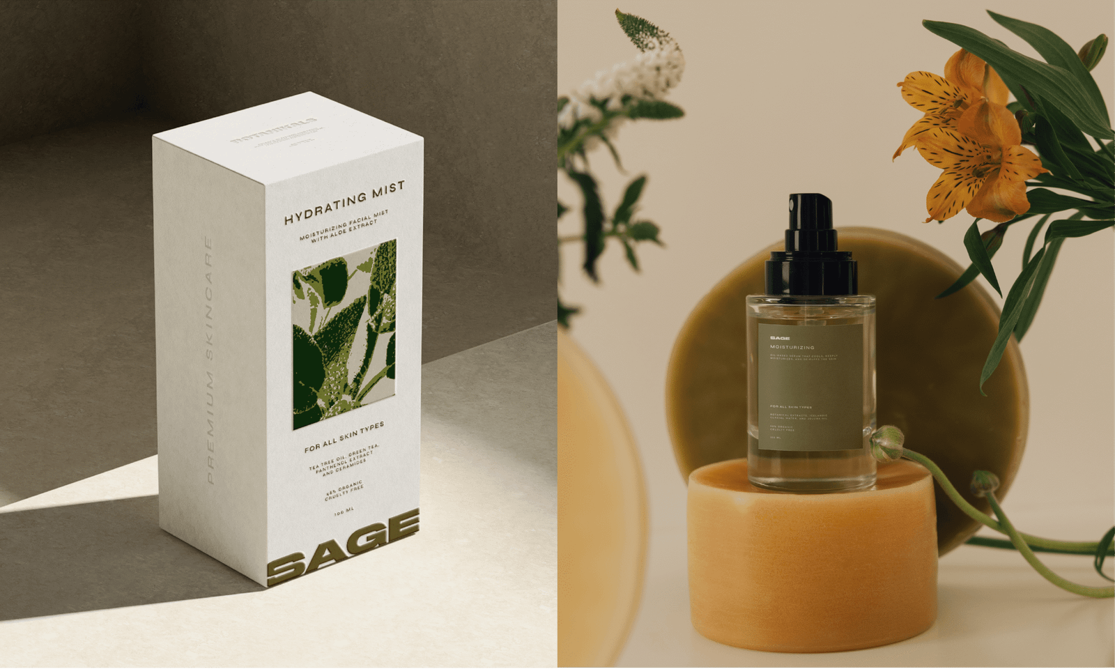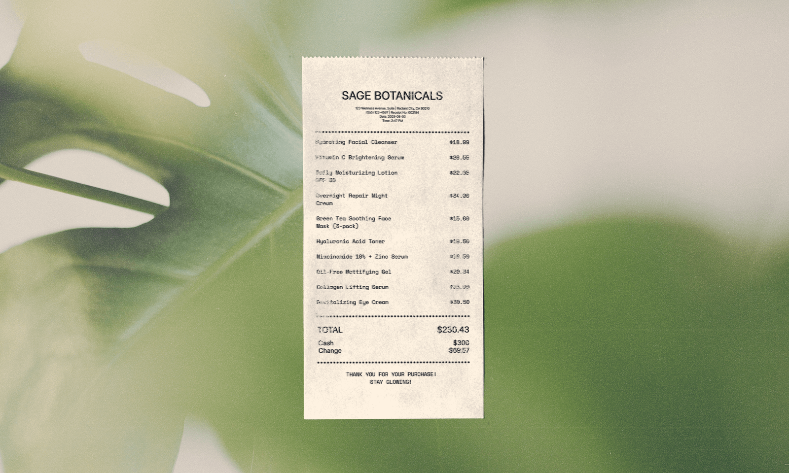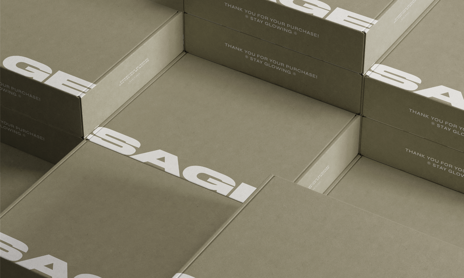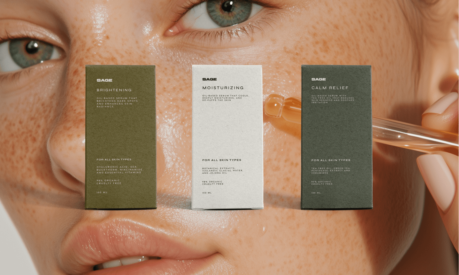
In a competitive natural skincare market, Sage needed a distinctive brand identity that could communicate its connection to nature while establishing a modern, refined, and recognizable presence. The challenge was to move beyond familiar organic design conventions and create a visual identity that felt elevated without losing the warmth, authenticity, and simplicity at the heart of the brand. Every element needed to convey Sage’s botanical inspiration and mindful approach to skincare while appealing to consumers who value conscious living, understated luxury, and meaningful self-care rituals.
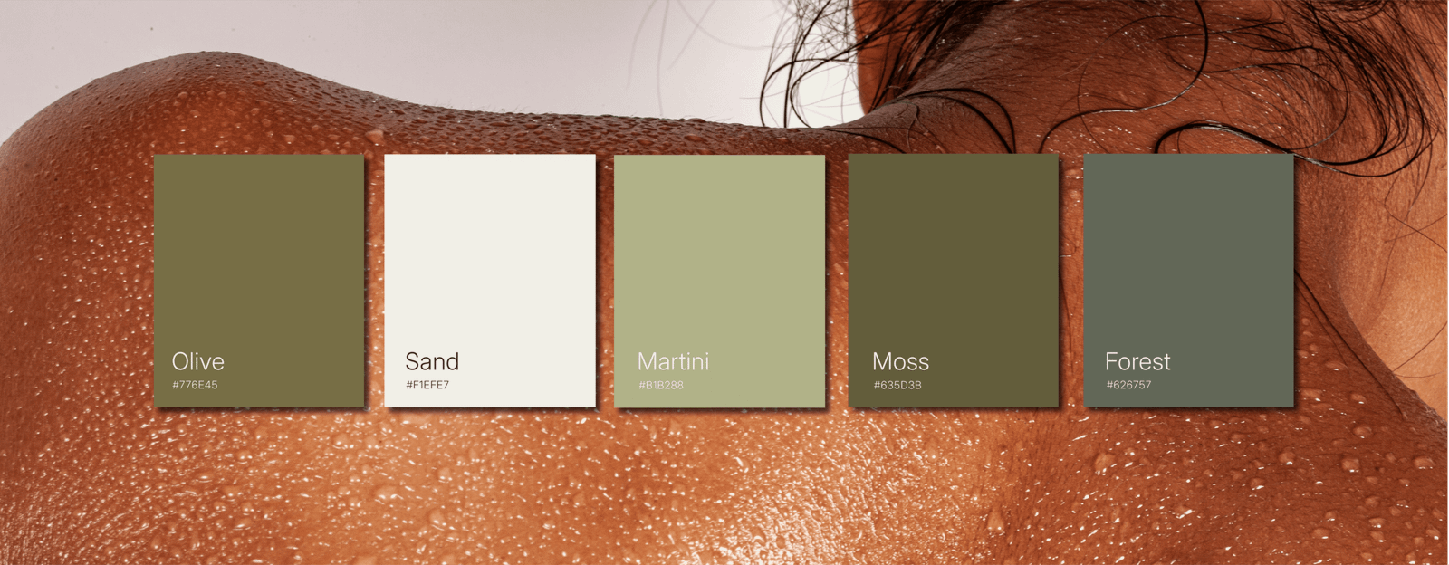
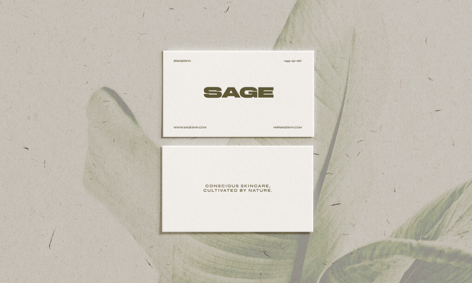
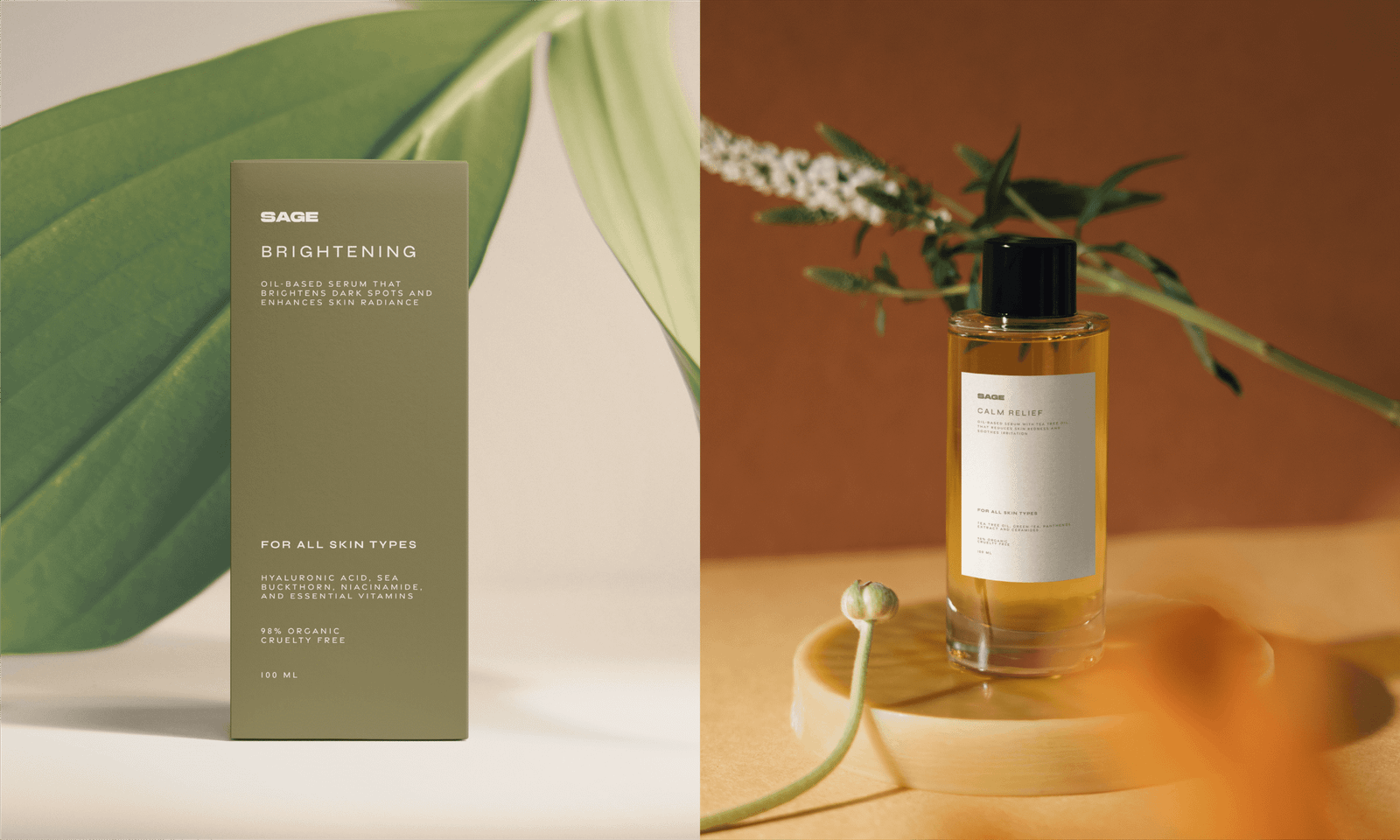
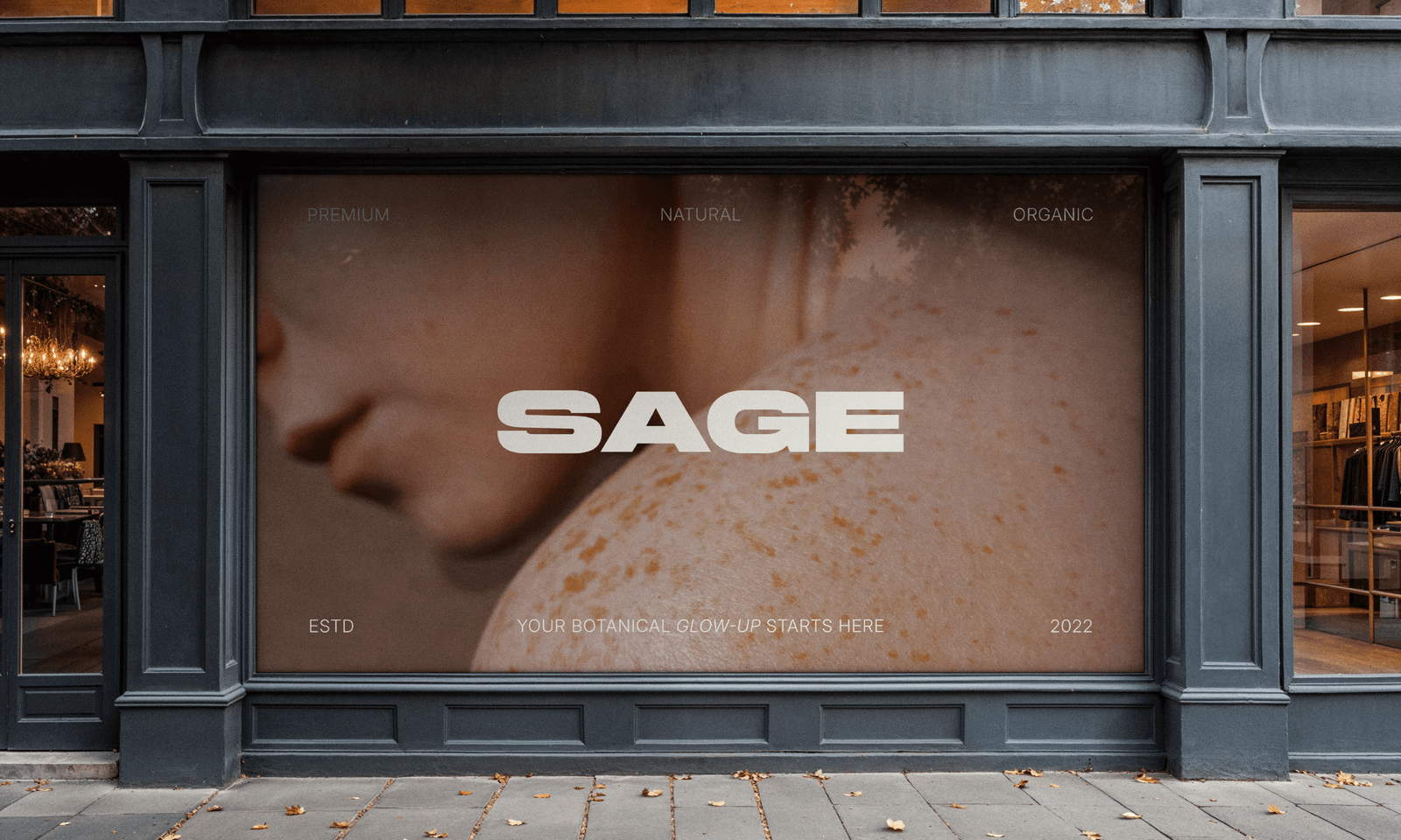
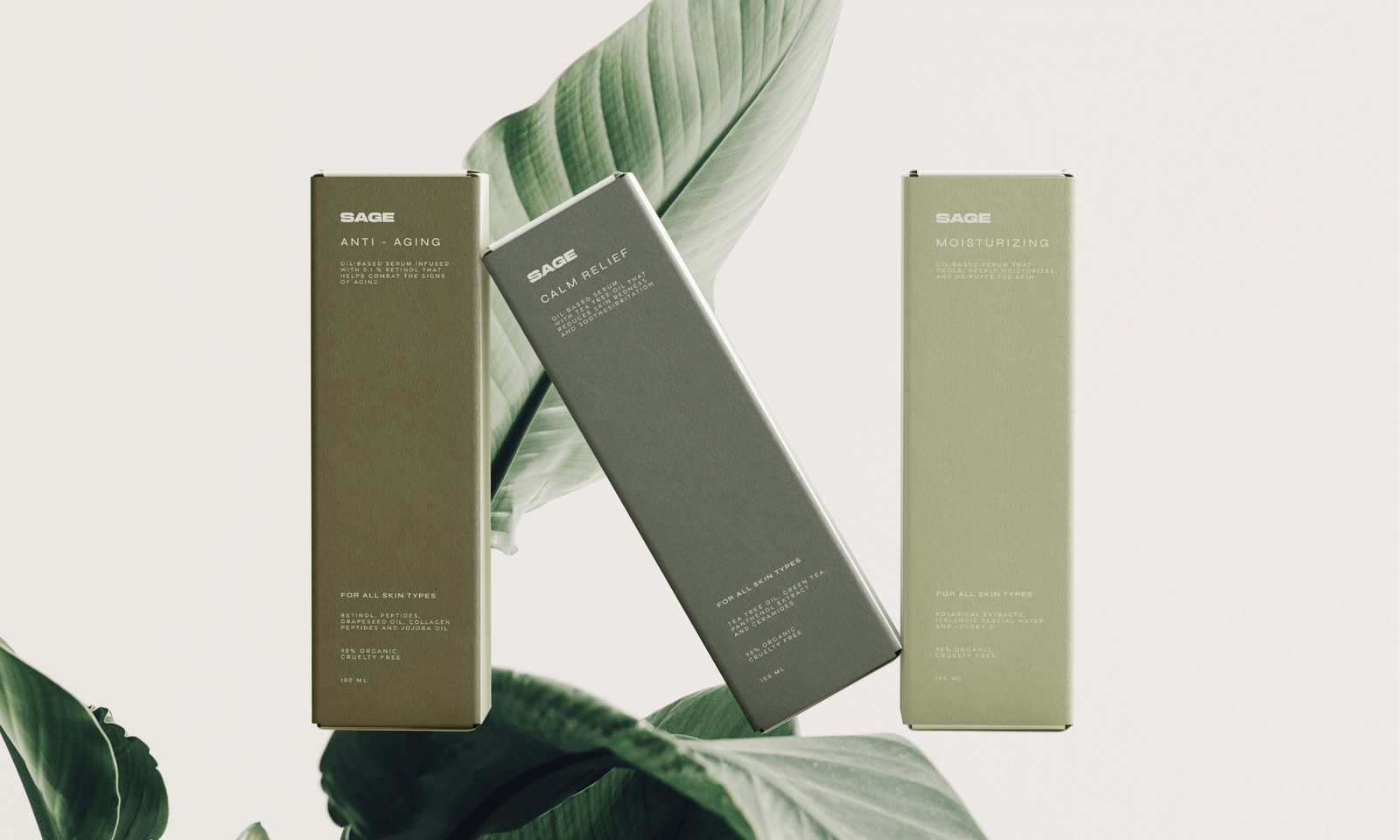
The solution was to develop a cohesive natural skincare brand identity built around the balance of bold minimalism and organic elegance. A clean, contemporary sans-serif logo establishes clarity and confidence, while a carefully curated palette of greens, from muted olive to deep forest draws inspiration from nature and communicates calm, growth, and renewal. Together, these design decisions establish a recognizable and cohesive brand identity that translates Sage’s botanical roots and conscious skincare philosophy into a refined visual experience, helping the brand stand apart through simplicity, intention, and a strong connection to nature.